The Farnsworth Project: Modern Colonial
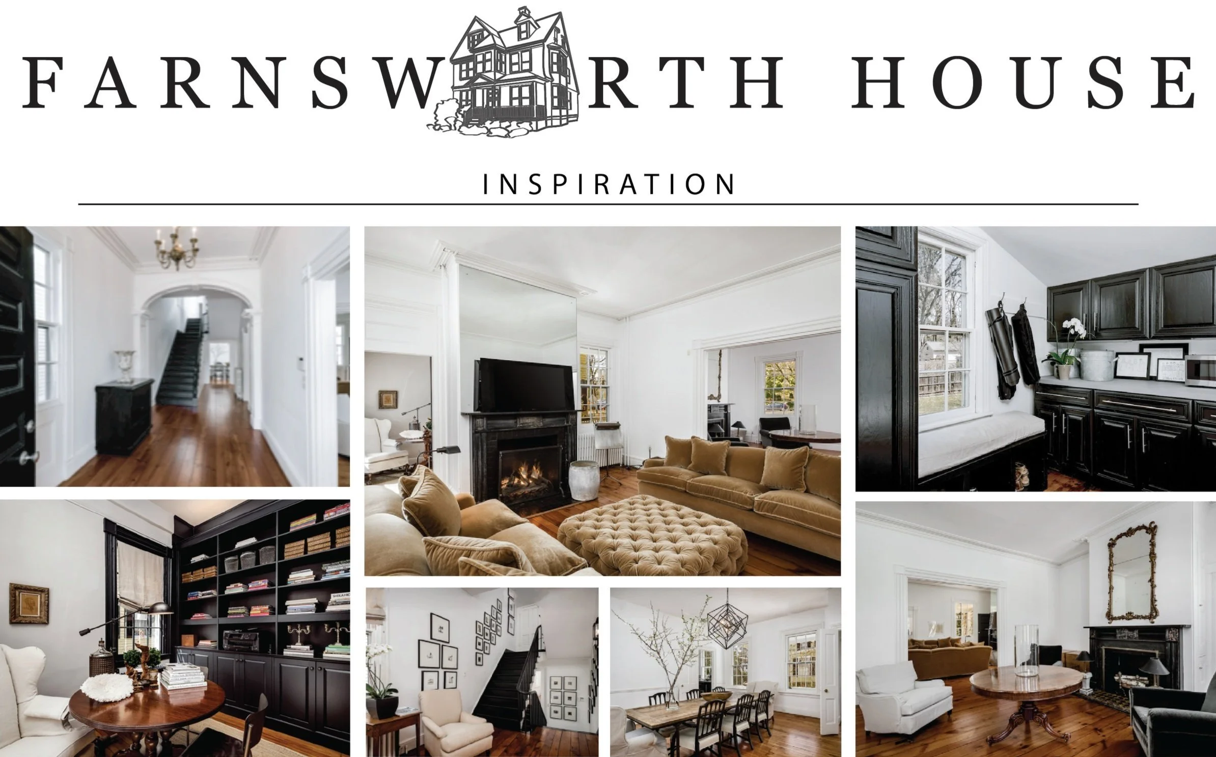
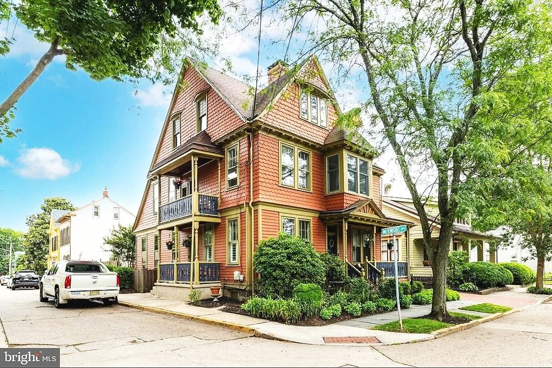
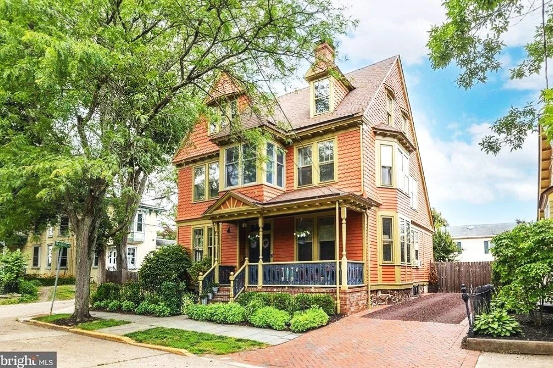
No. 3 Farnsworth was a truly special project. A Victorian home built in 1890, rich with original character and craftsmanship. Preserving and celebrating the home’s historic architecture was central to my approach, from the intricate metalwork to the detailed molding and woodwork. With so much inherent charm, the house offered a beautiful foundation to build upon.
I approached the redesign with a Minimal Modern Colonial aesthetic, allowing the space to feel refreshed and contemporary without competing with its original details. The goal was to modernize thoughtfully, ensuring the historic elements remained the true focal point.
The clients envisioned a full interior transformation, so the project began with a clean, cohesive palette of crisp white layered with intentional black accents. These darker elements were carefully placed to highlight the home’s original architectural features. We stripped the walls, removed outdated carpeting and window treatments, refinished select floors, and allowed the architecture to breathe. While darker furnishings add depth and contrast, the home’s soaring ceilings, oversized windows, and whitewashed walls create a light, airy atmosphere. Resulting in a space that feels both timeless and refreshed.

c o l o r s t o r y
overall mood
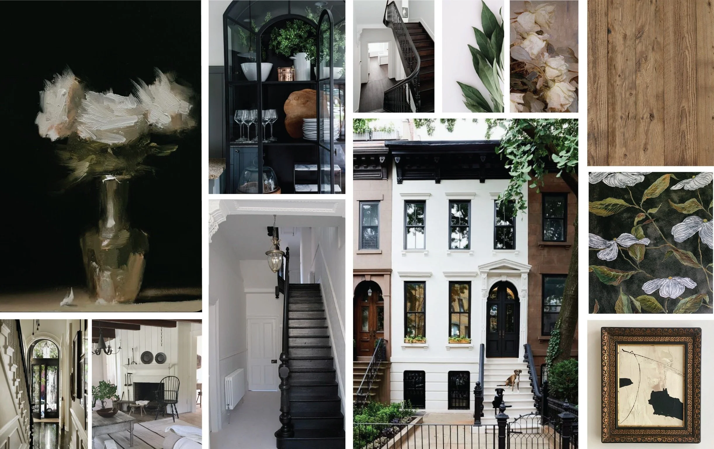
Timeless, architectural, and quietly dramatic. A refined balance of historic elegance and modern restraint. The palette is intentionally minimal, allowing original Victorian details to remain the hero while subtle contrast brings the home into the present.
The home feels light, intentional, and enduring. It where historic beauty is preserved, not overshadowed. Crisp whites allow the architecture to breathe, while black accents trace and emphasize its bones. Every material choice feels deliberate, resulting in a space that honors its 1890 origins while living effortlessly in the present day.
No. 3 Farnsworth is a study in restraint. It is the proof that sometimes the most powerful design move is knowing what to preserve.
color
Crisp Foundations
Soft white & chalky ivory — whitewashed walls and ceilings that brighten the home and amplify its soaring proportions
Warm porcelain — a slightly softened white that keeps the space from feeling stark while honoring the age of the home
Architectural Contrast
True black & soft charcoal — used with intention on metalwork, lighting, hardware, and select furnishings to frame and highlight original details
Deep graphite — grounding accents that add depth without overpowering the space
Historic Warmth
Aged wood tones — refinished floors and original millwork revealing natural patina and craftsmanship
Antique brass & darkened iron — finishes that feel appropriate to the era while still refined and modern
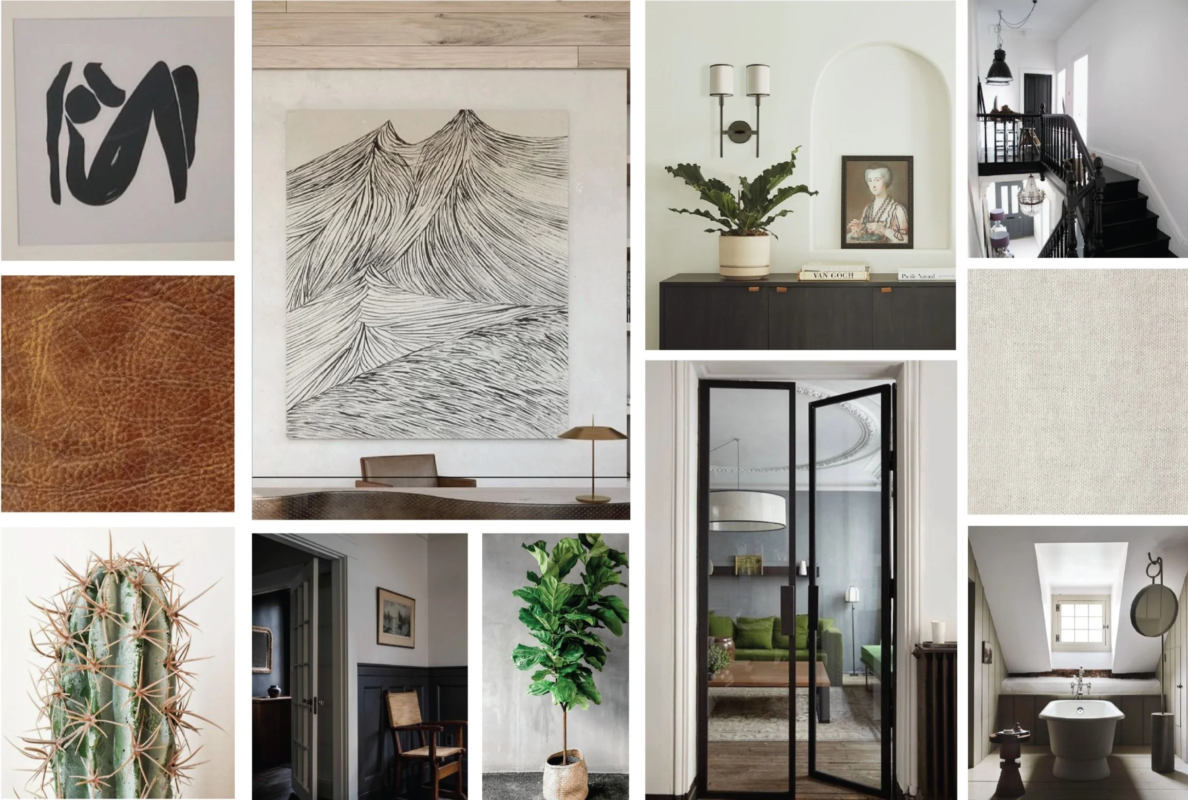
texture & materiality
Preserved Character
Original woodwork & molding — left clean and honest, allowing craftsmanship to speak for itself
Decorative metal details — railings, grilles, and accents that add delicate ornamentation and contrast against crisp walls
Modern Restraint
Matte finishes — walls, cabinetry, and furnishings that absorb light softly and feel calm and contemporary
Tailored upholstery — structured silhouettes in darker tones to anchor rooms and provide visual weight
Layered Simplicity
Natural textiles — cotton, wool, and subtle linen blends that feel understated and timeless
Refined stone or solid surfaces — clean-lined and unfussy, supporting the home’s quiet sophistication
THE FARNSWORTH HOUSE
B E F O R E & A F T E R
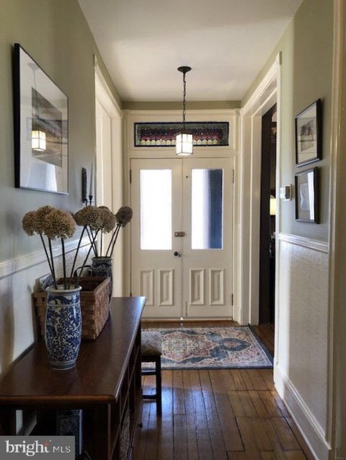
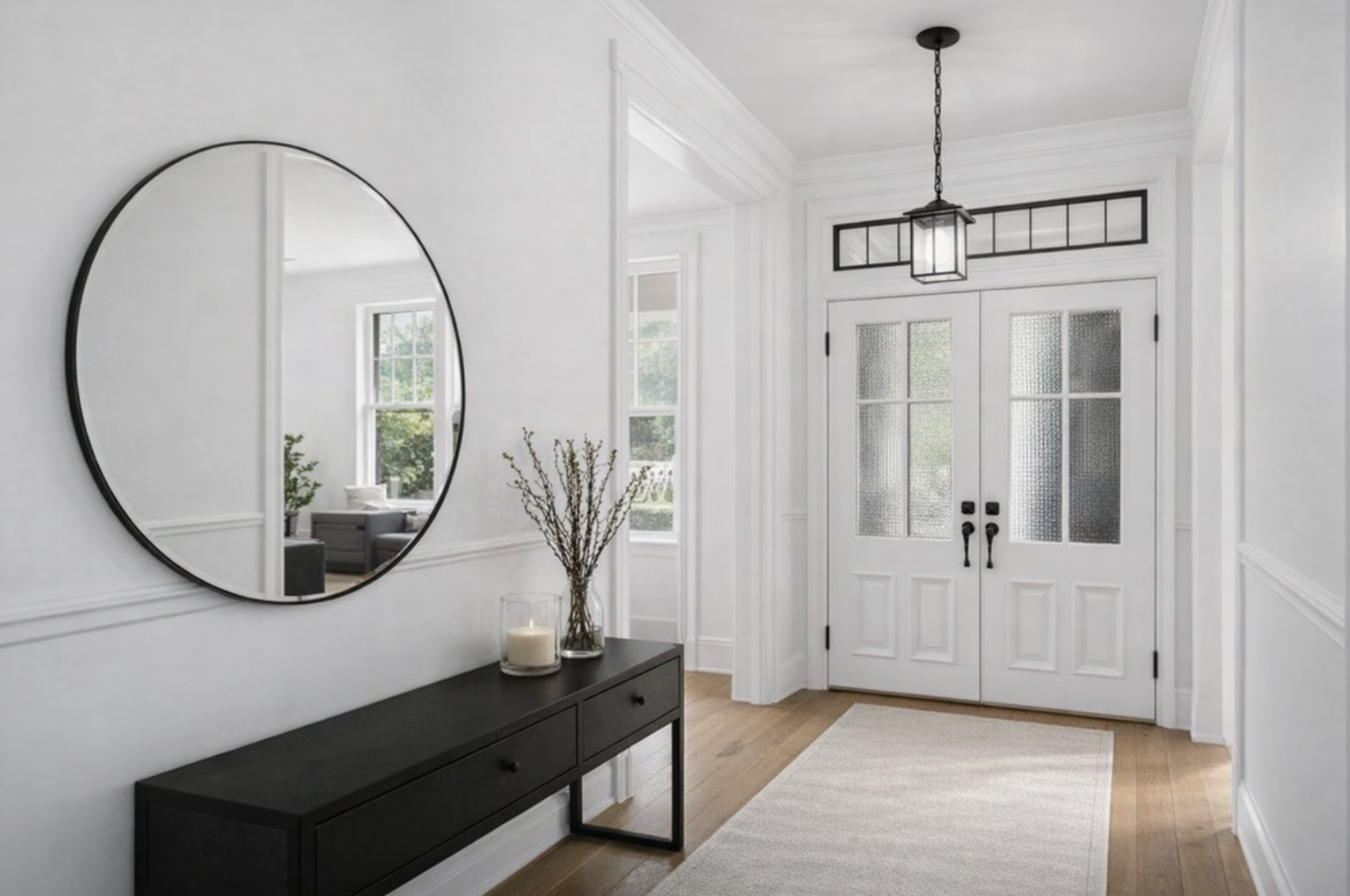
FOYER
-
![]()
B E F O R E
-
![]()
A F T E R
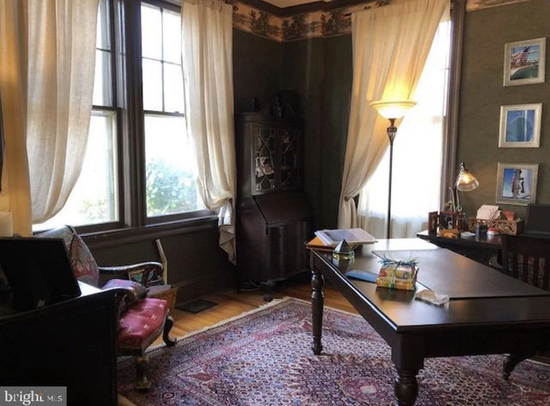
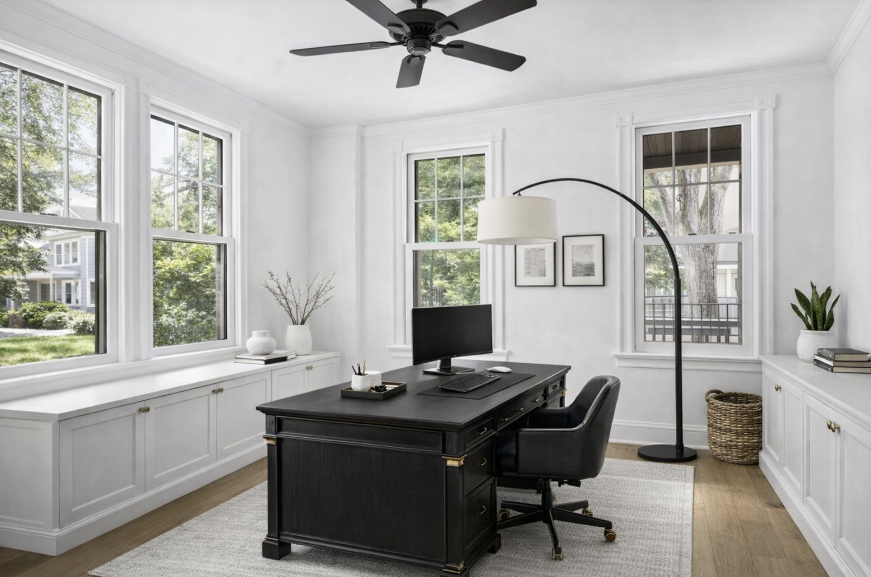
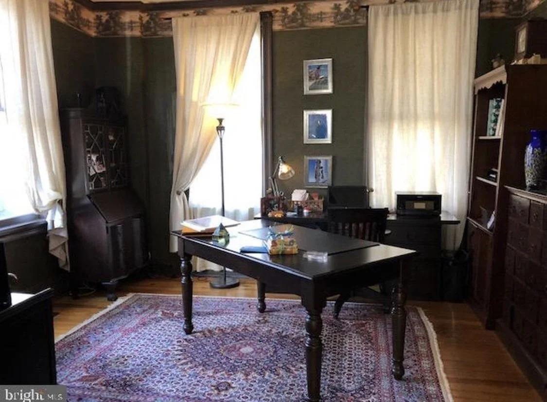
OFFICE
-
![]()
B E F O R E
-
![]()
A F T E R
-
![]()
B E F O R E
-
![]()
A F T E R

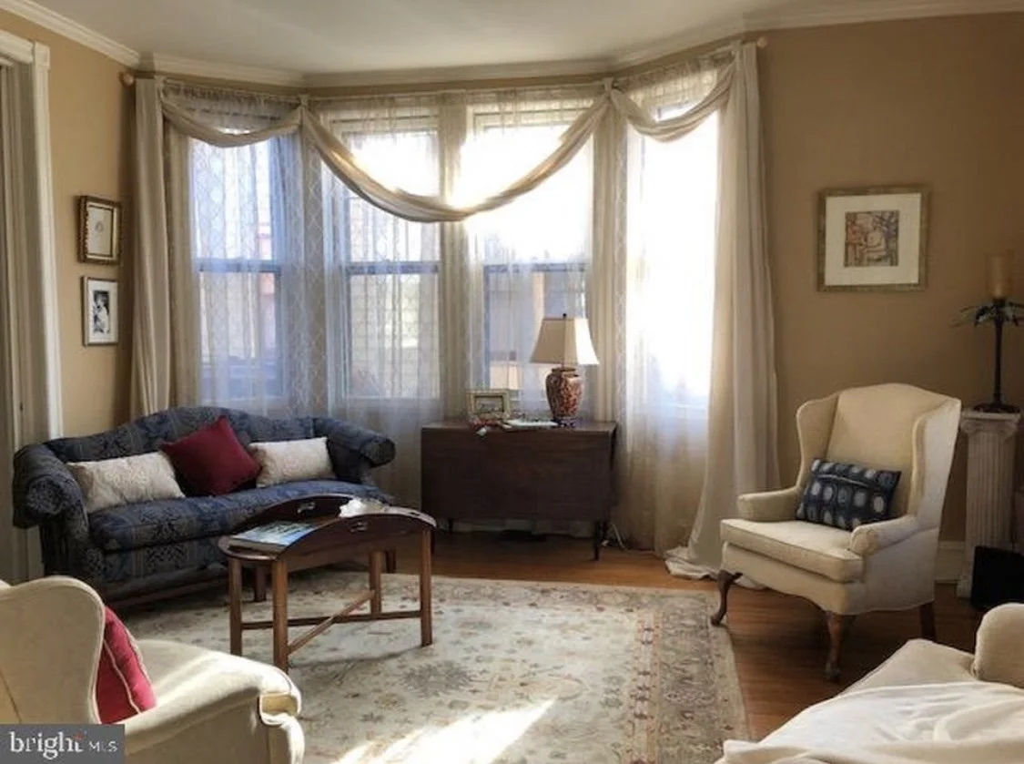
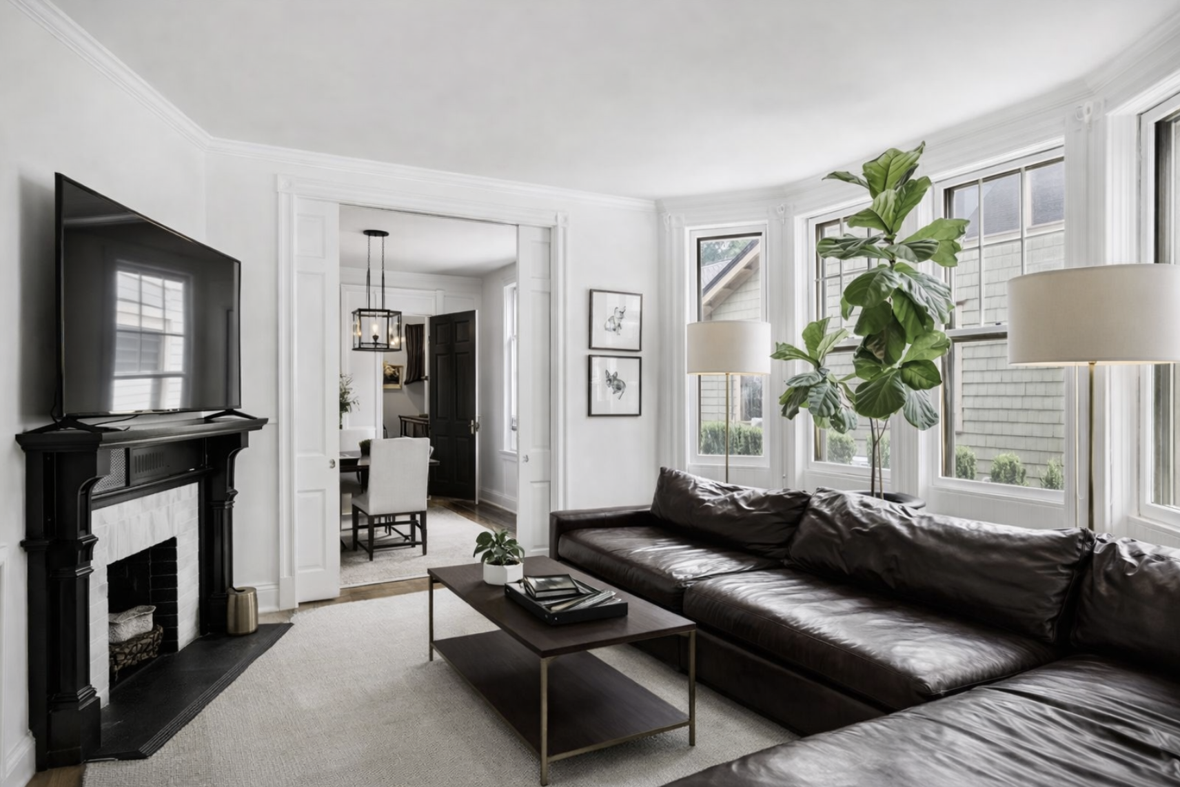
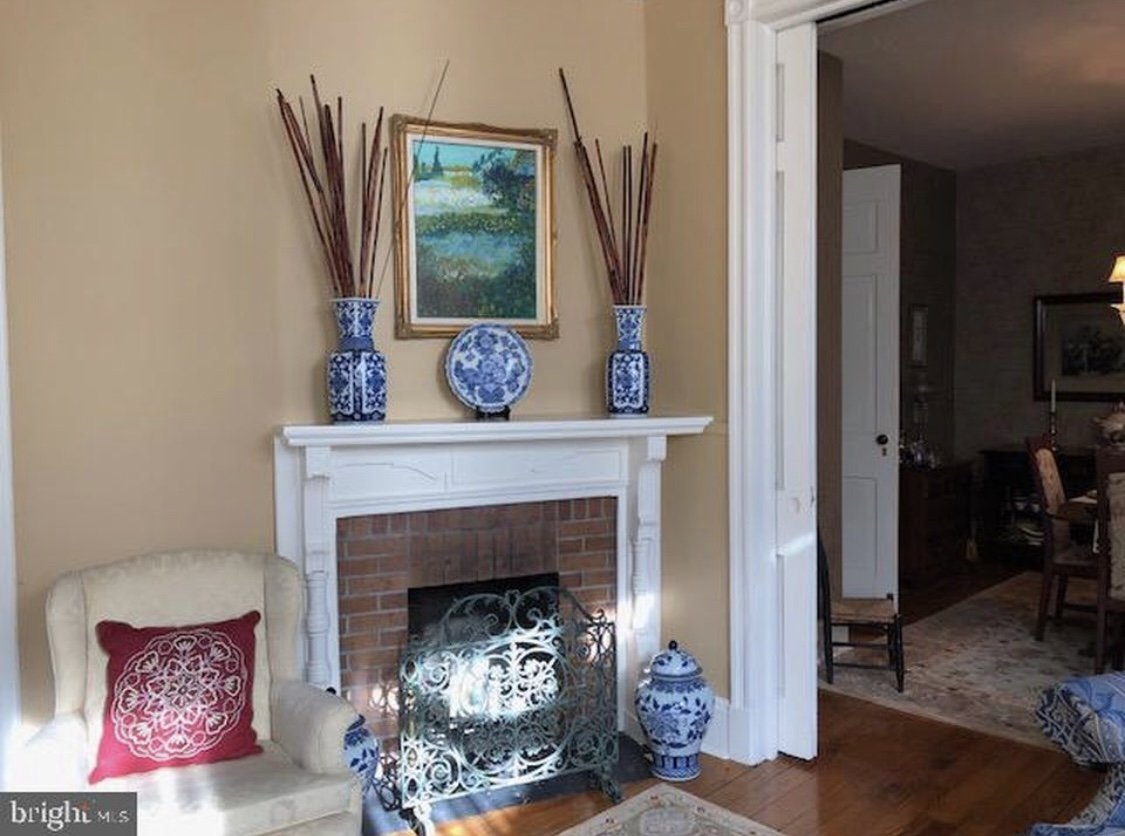
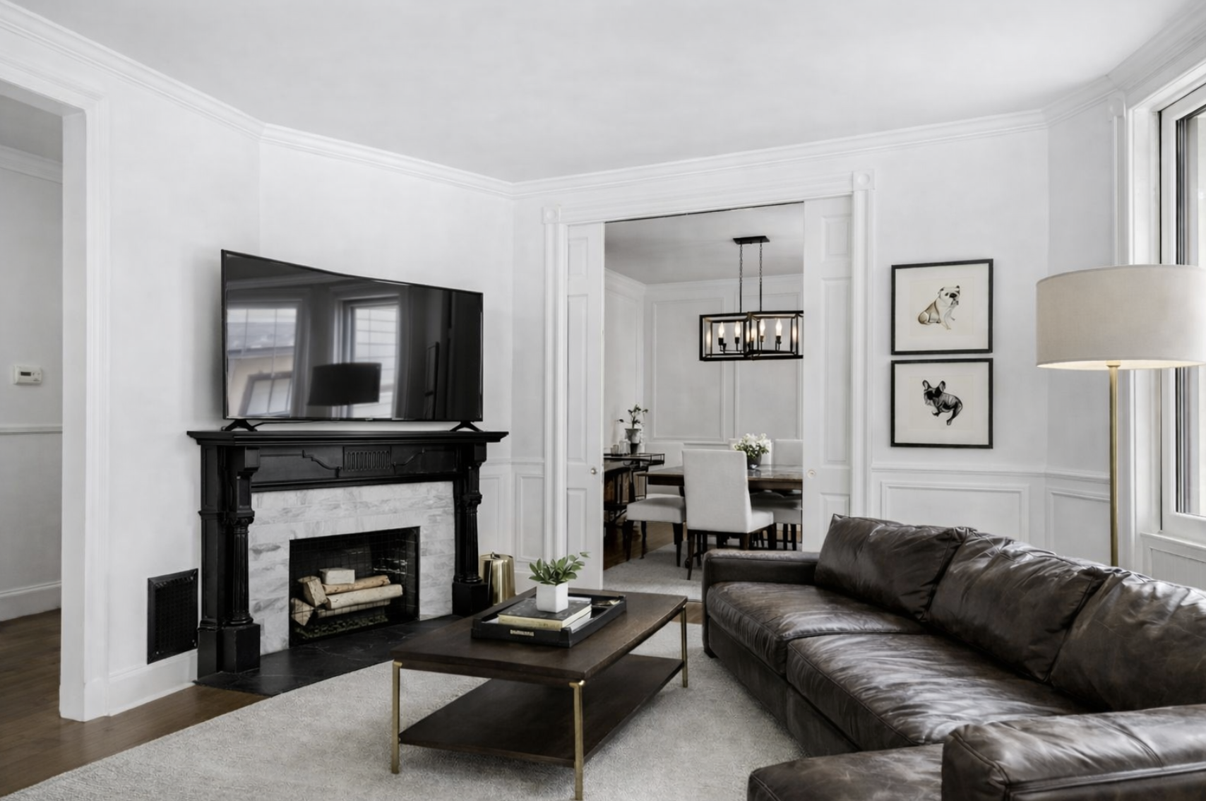
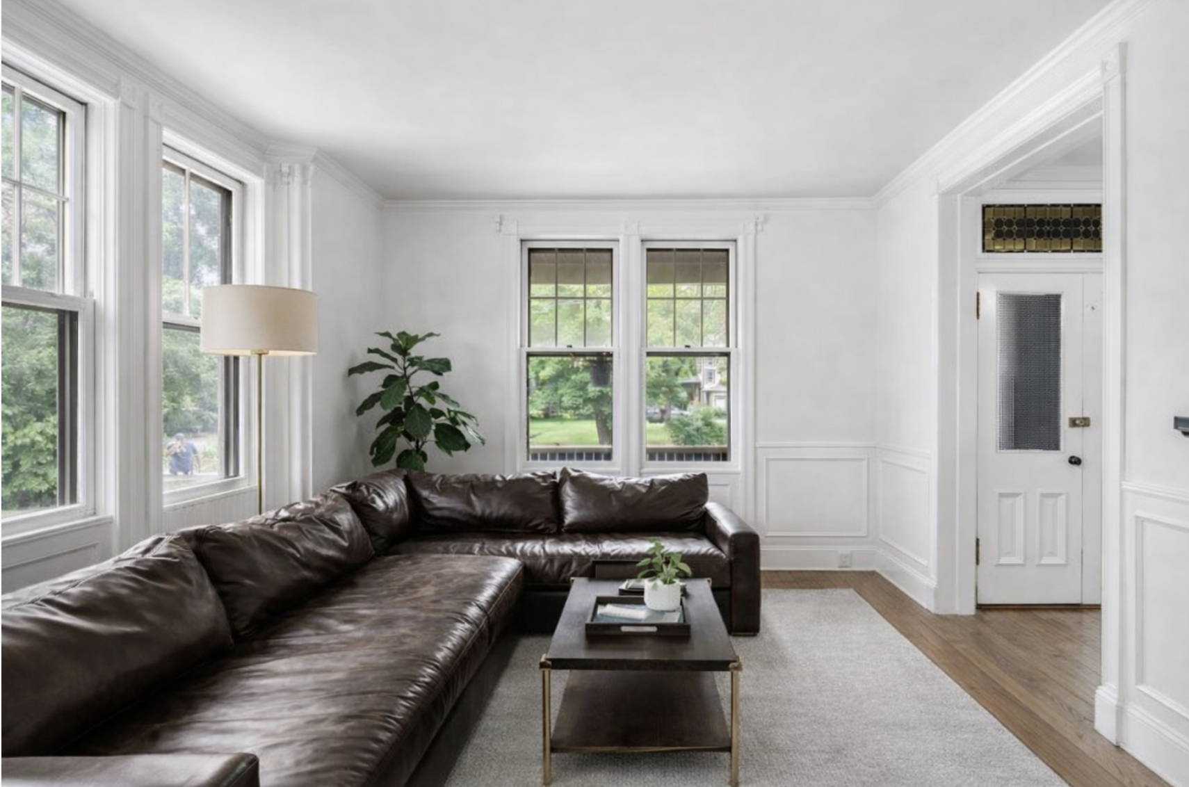
LIVING ROOM
-
![]()
B E F O R E
-
![]()
A F T E R
-
![]()
B E F O R E
-
![]()
A F T E R
-
![]()
B E F O R E
-
![]()
A F T E R

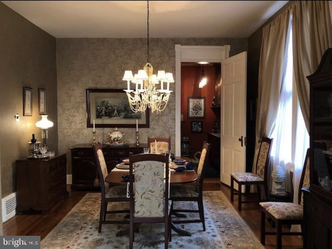
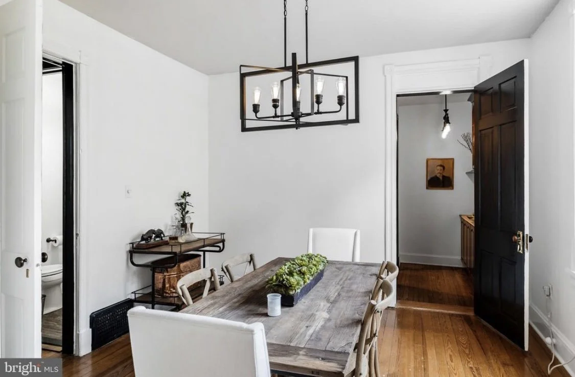
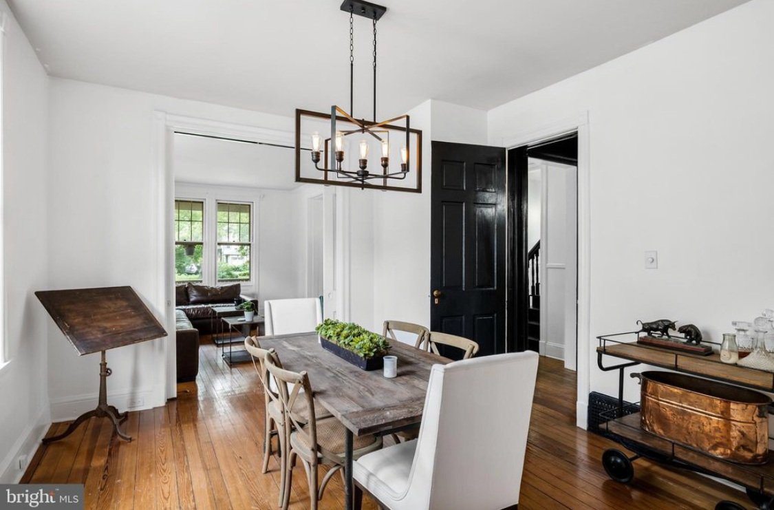
DINING ROOM
-
![]()
B E F O R E
-
![]()
A F T E R
-
![]()
A F T E R
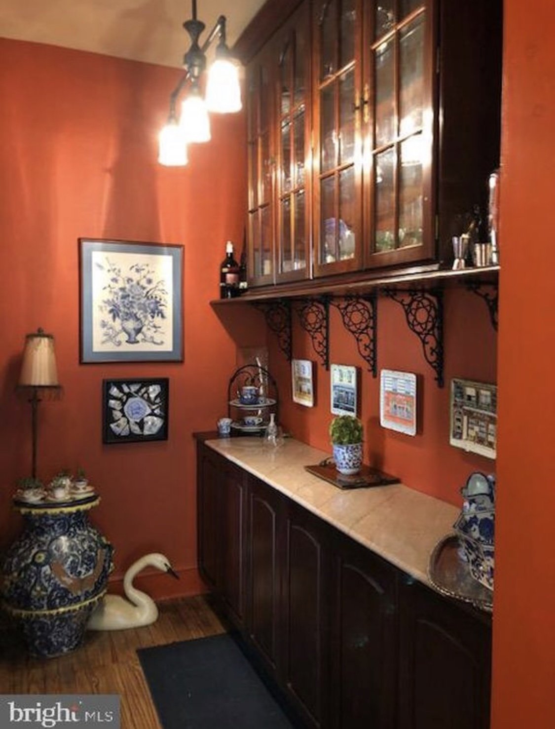
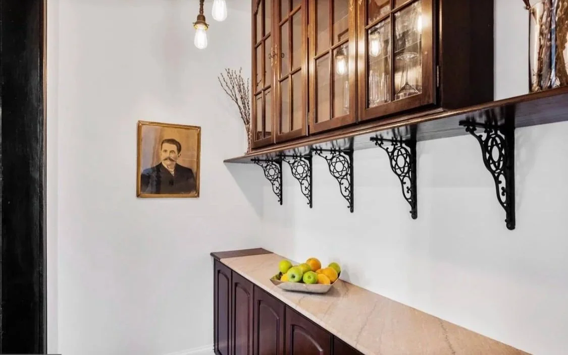
BUTLER’S PANTERY
-
![]()
B E F O R E
-
![]()
A F T E R
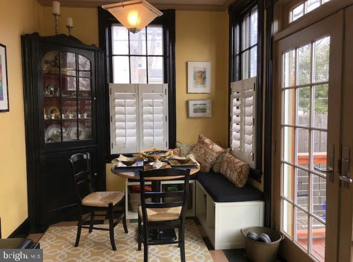
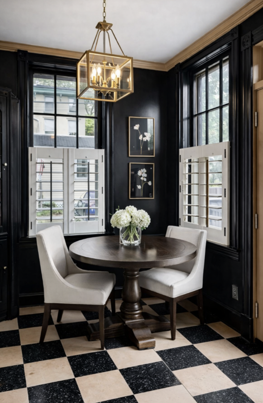
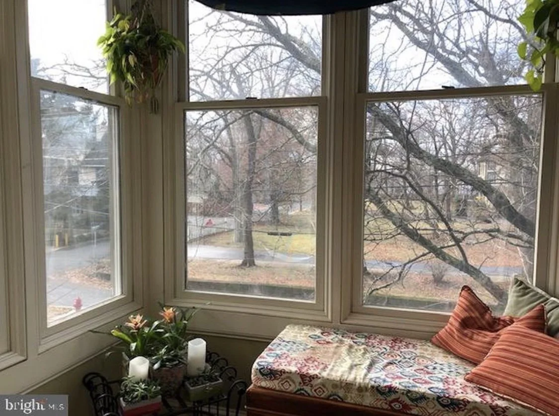
BREAKFAST NOOK
-
![]()
B E F O R E
-
![]()
A F T E R
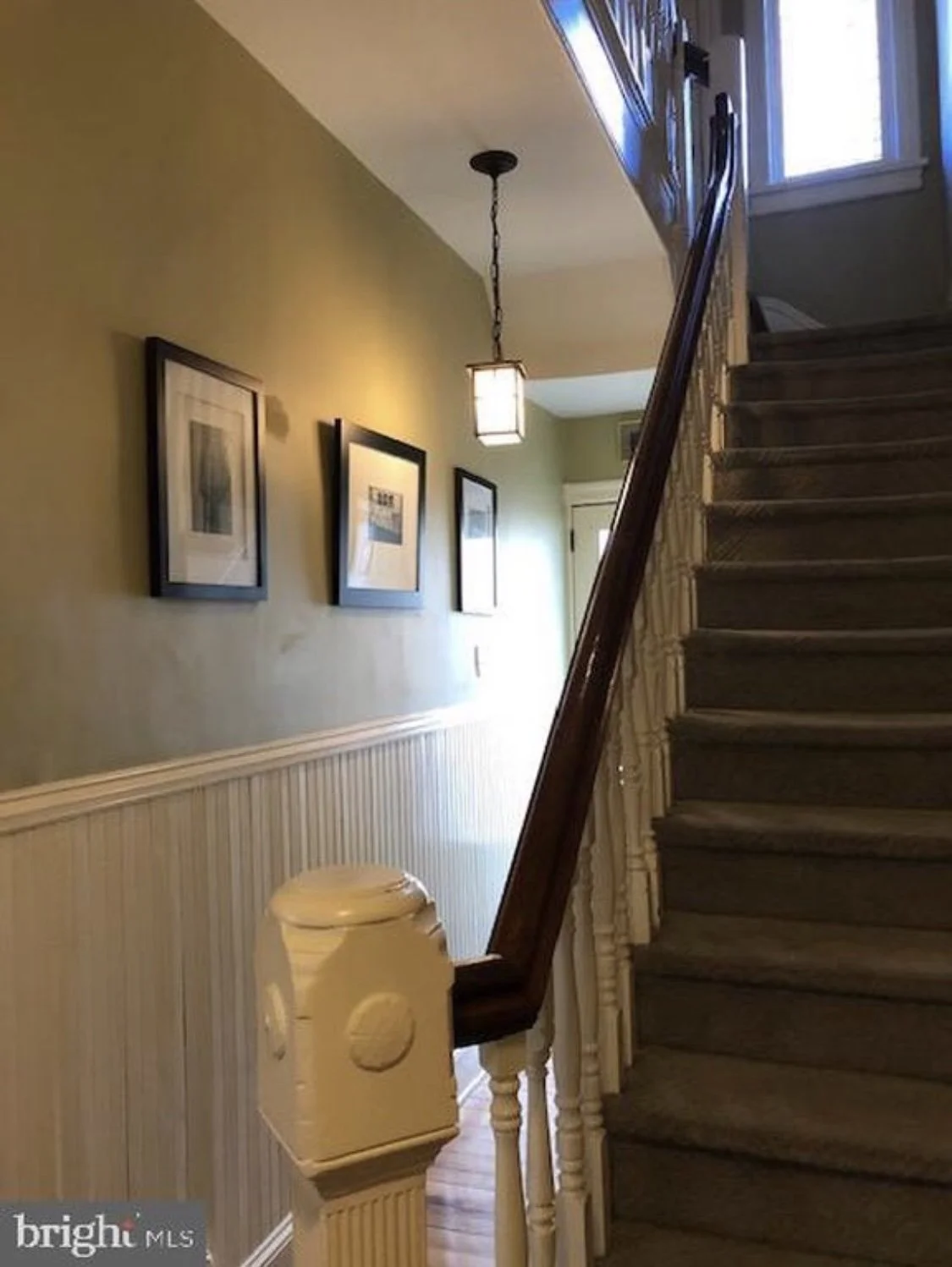
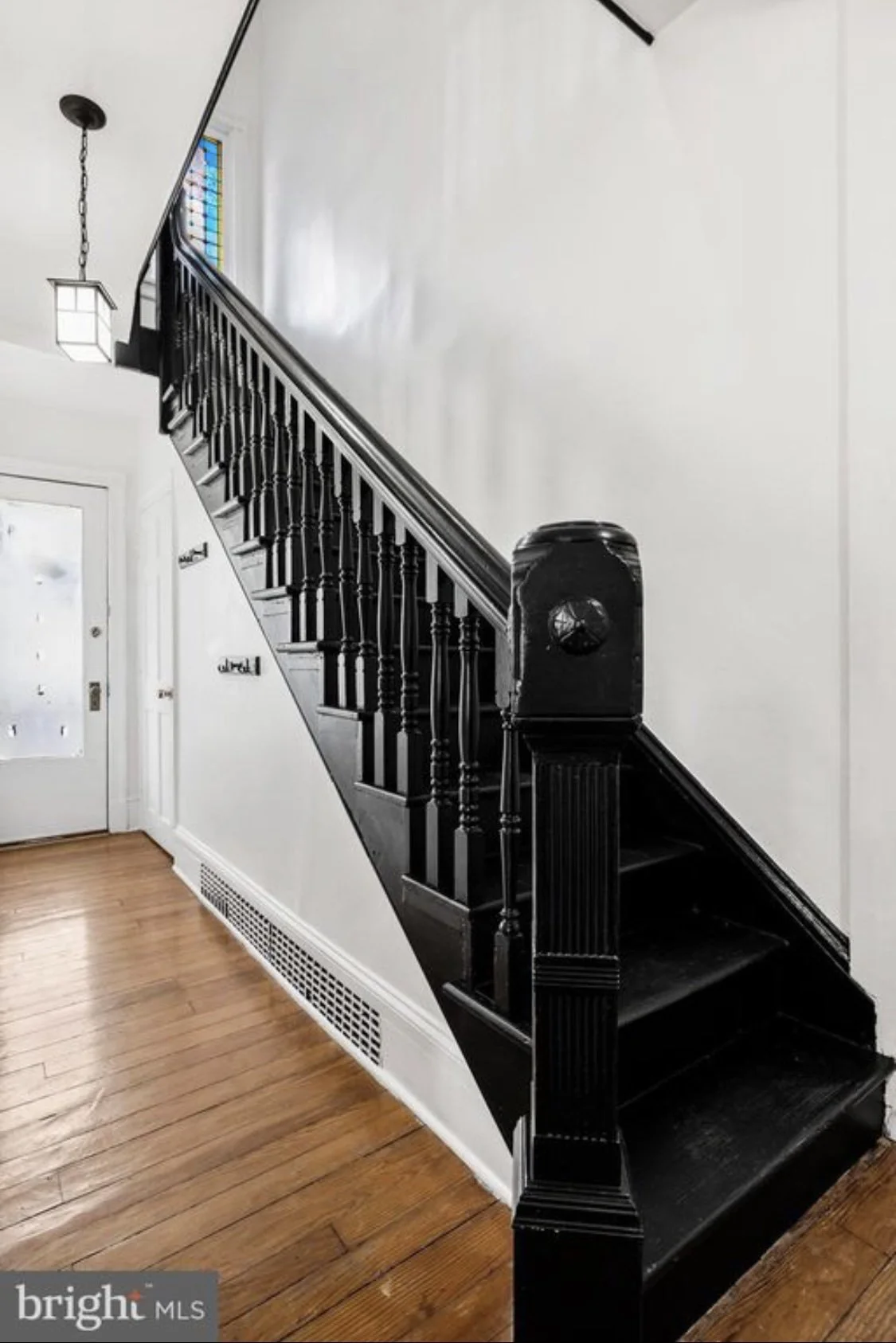
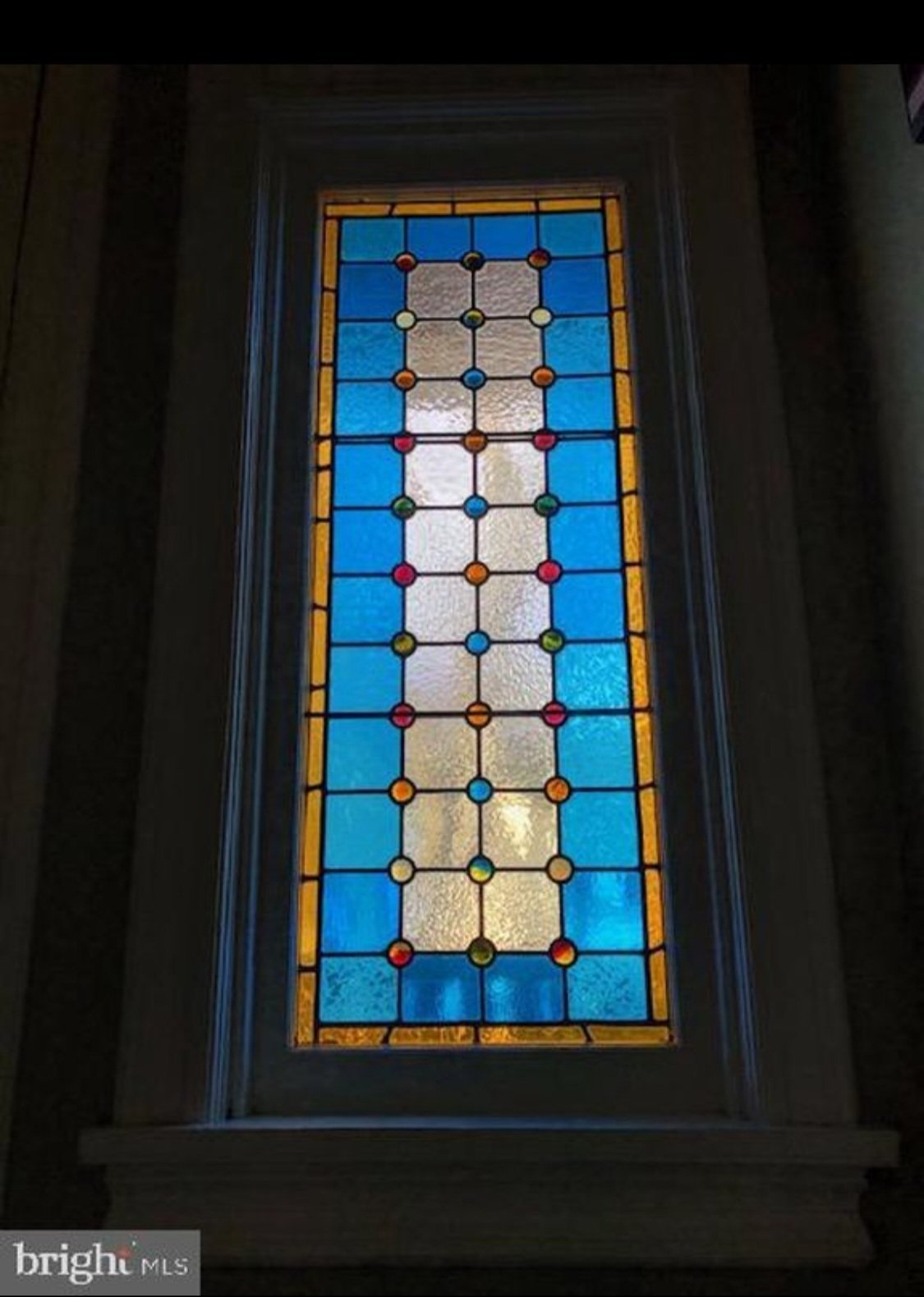
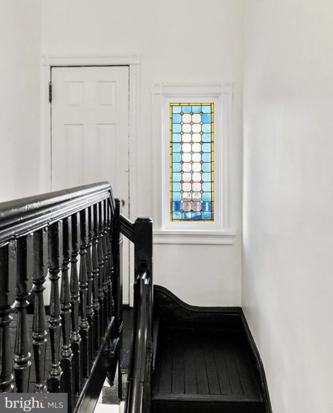
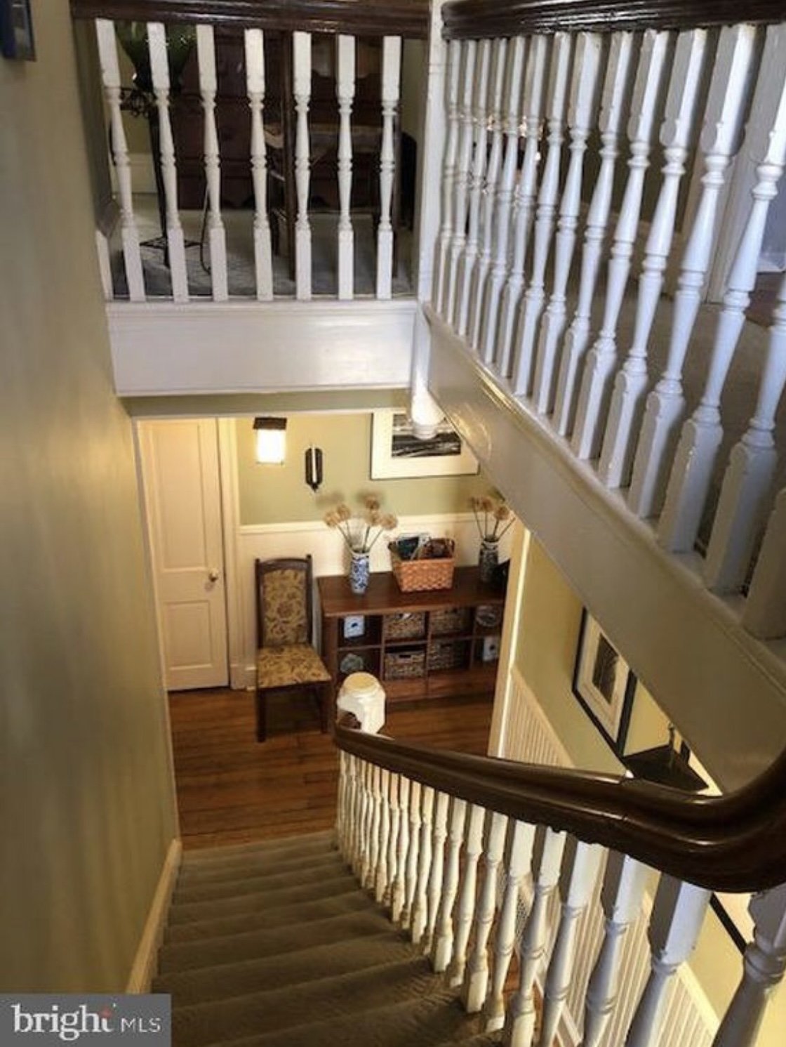
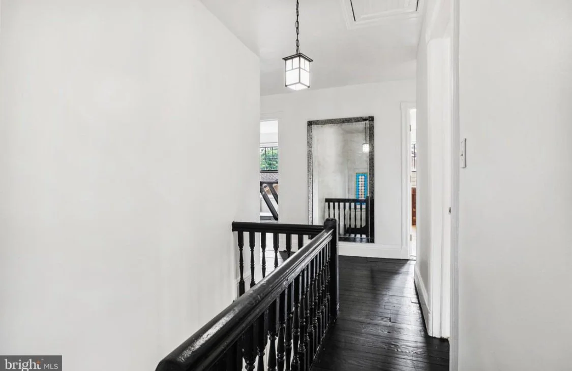
GRAND STAIR
-
![]()
B E F O R E
-
![]()
A F T E R
-
![]()
B E F O R E
-
![]()
A F T E R
-
![]()
B E F O R E
-
![]()
A F T E R
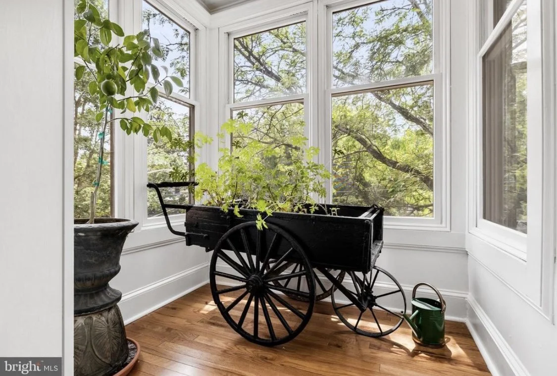
SUNROOM
-
![]()
B E F O R E
-
![]()
A F T E R
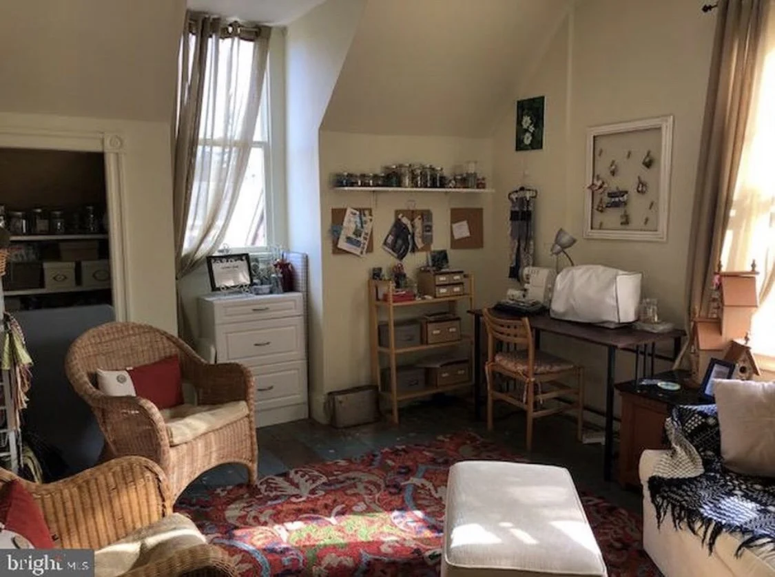
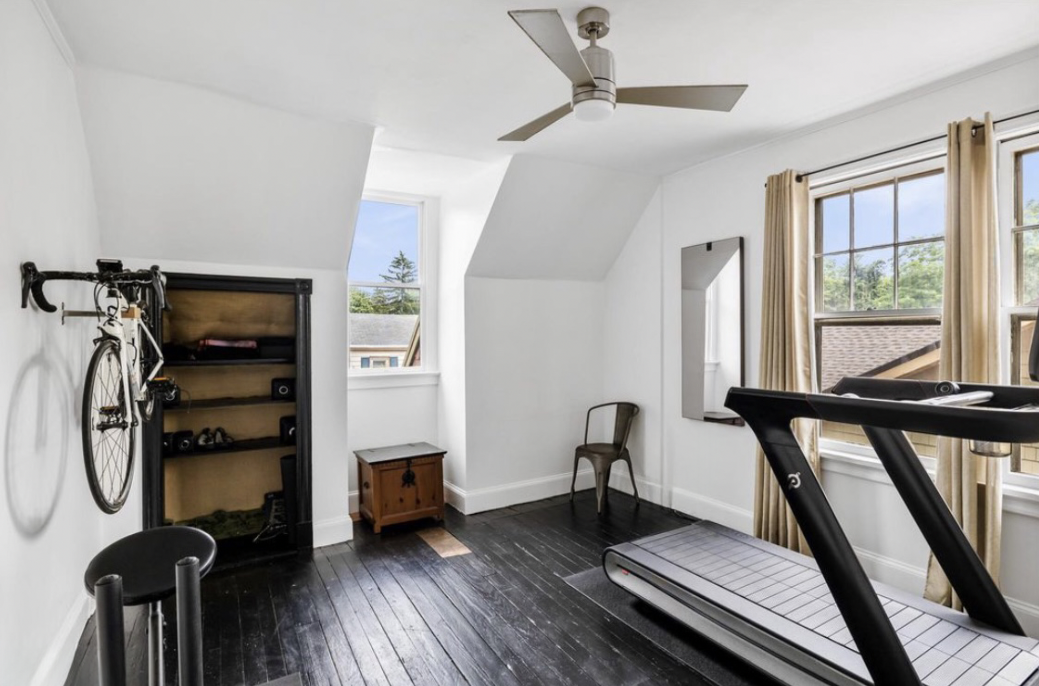
SPARE ROOM
-
![]()
B E F O R E
-
![]()
A F T E R
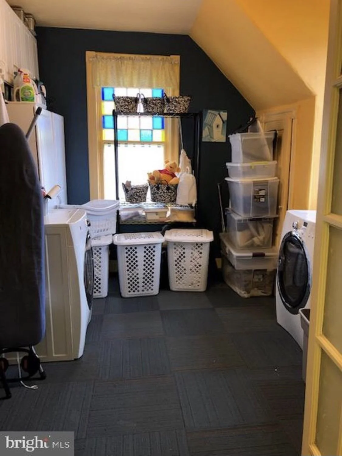
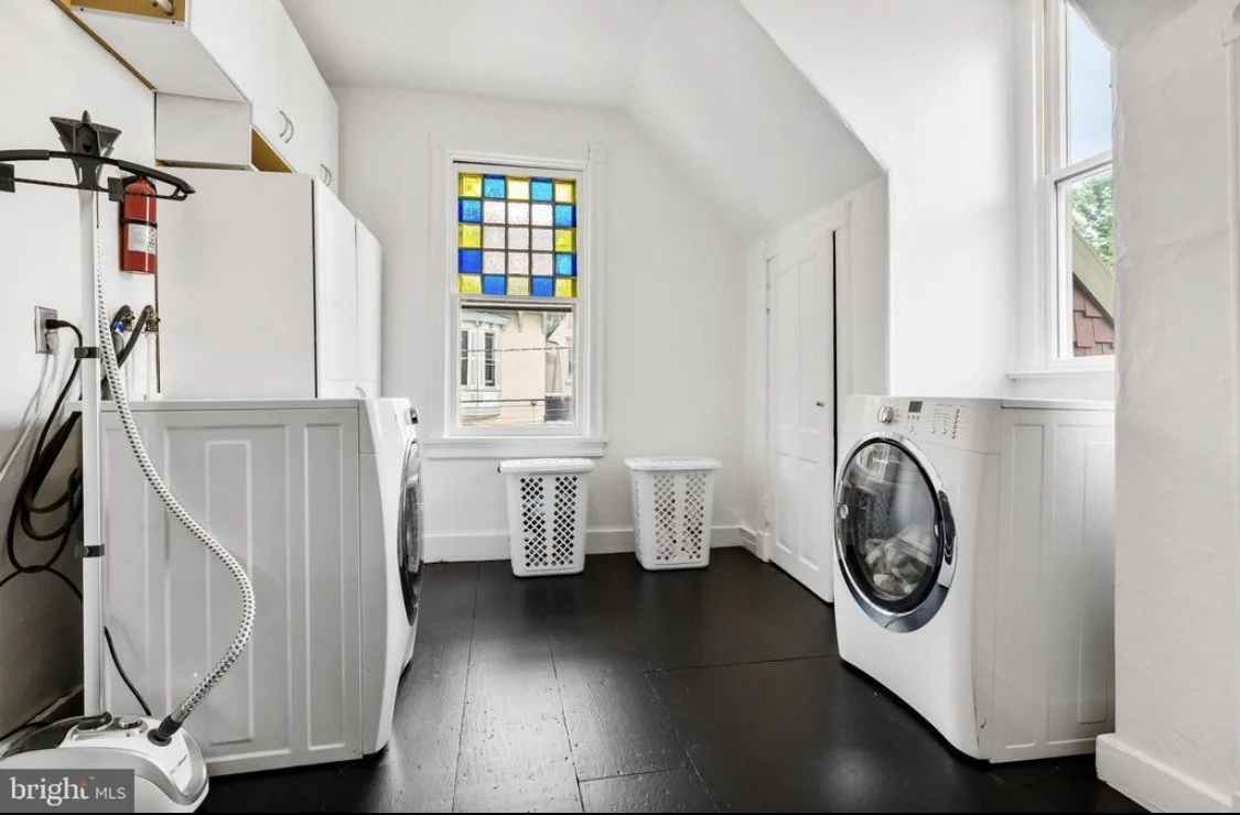
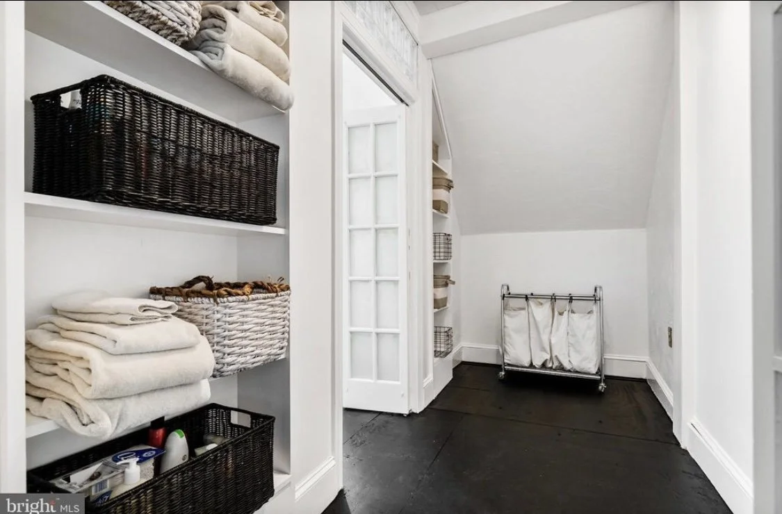
LAUNDRY SUITE
-
![]()
B E F O R E
-
![]()
A F T E R
-
![]()
A F T E R
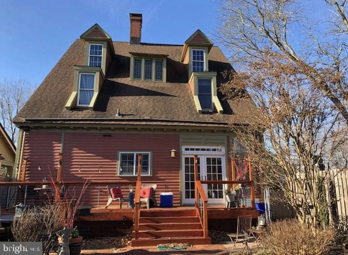
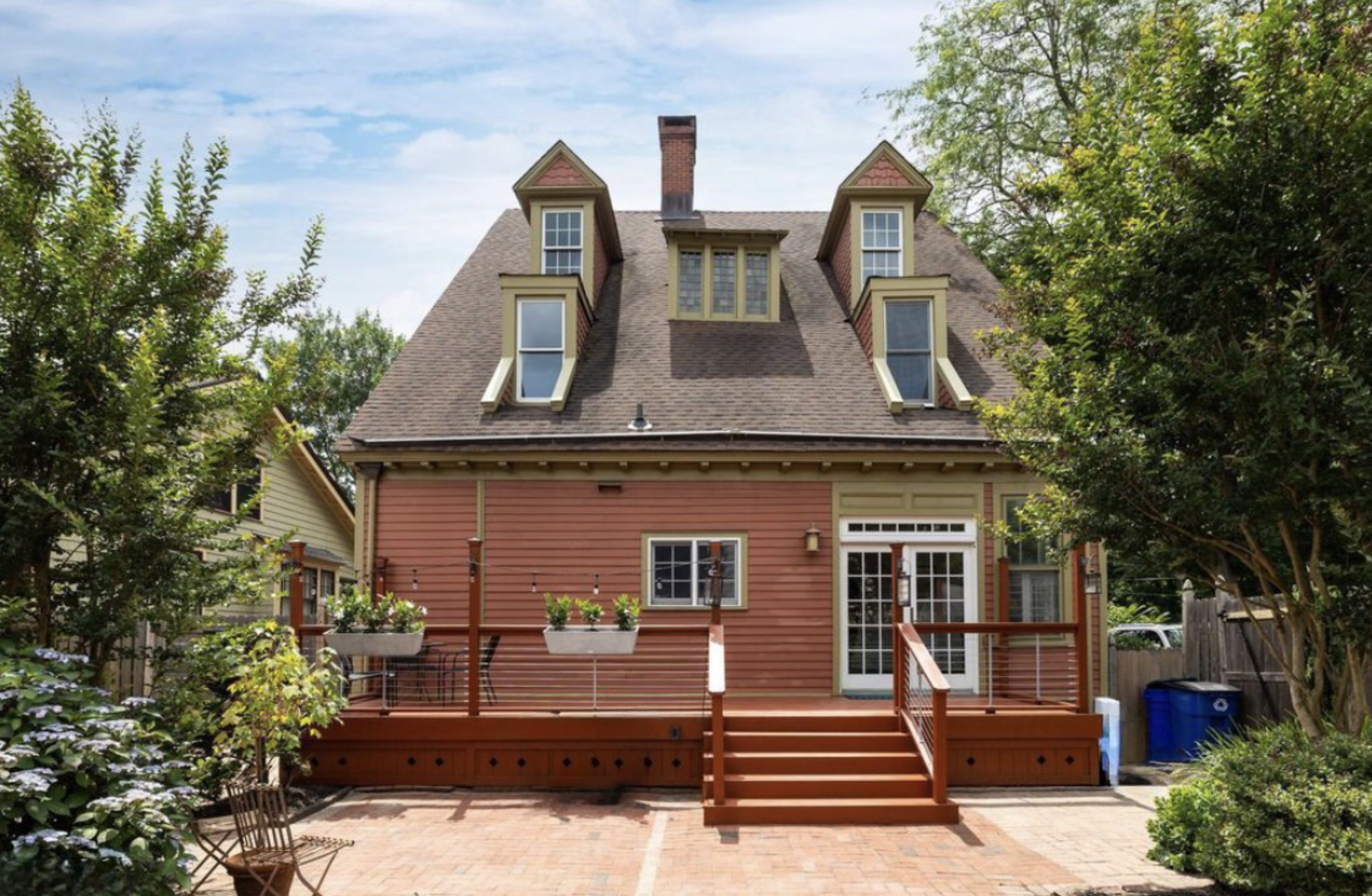
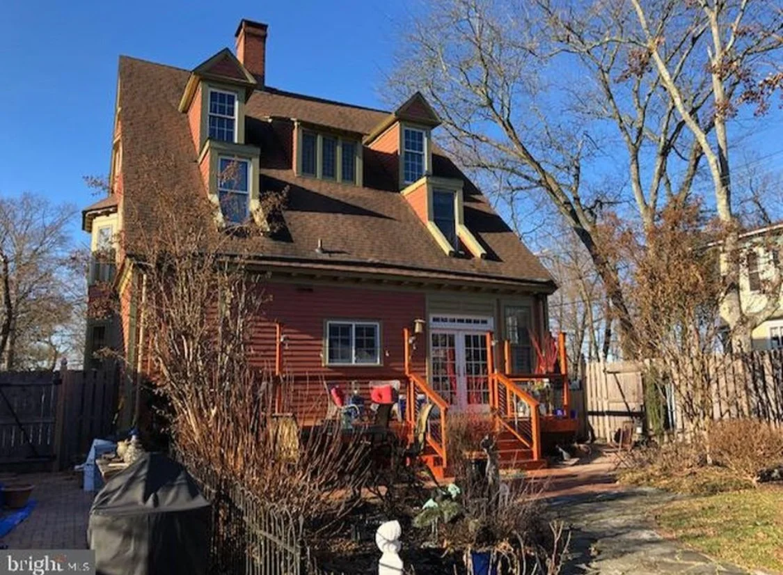
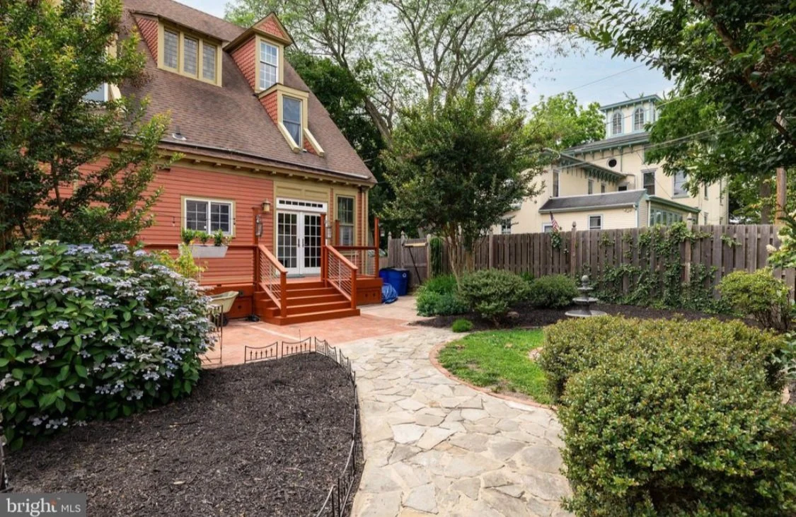
BACK GARDEN
-
![]()
B E F O R E
-
![]()
A F T E R
-
![]()
B E F O R E
-
![]()
A F T E R